.png)
Designer Approved Farrow & Ball Colours - Part One: Neutrals
- The Interior Edition

- Sep 17, 2025
- 6 min read
Decorating your home is a big thing. It goes beyond choosing the perfect colour. It's about finding a colour that speaks to you, resonates with your style and creates the atmosphere you desire for your space. There are just so many choices it can be such a difficult decision. Your home is your sanctuary and its decoration should evoke feelings of safe, warm and most of all love and emotion. It should make you want to be home just to envelope yourself in its splendour. With that in mind I have gathered a few of my personal neutral favourites from the Farrow & Ball collection of colours and expressed why I believe these colours will resonate with you also.
Before I begin, lets just take a little look at Farrow & Ball as a company.
Farrow & Ball are renowned for their unique approach to colours and their somewhat quirky descriptive of each one. Each colour takes on a name that resonates with something from natural surroundings, historical or Architectural significance. They love to call a colour 'White', when it isn't even white! But I guess that's one of the reasons they have created such a following and gained strength in popularity over the past several years. Its now a thing for estate agents to mention in listings that a home is decorated throughout in Farrow & Ball, symbolising the paint's luxury quality and reputation, and almost using it to amplify the reason the house is priced the way it is. It has become a strong selling point!
Farrow & Ball have researched their market extensively to produce colours that play with a persons emotions and have the ability to be 'split personality' in their extraordinary response to light. Its almost like a new colour every few hours of the day creating a new experience each time you enter the room!
They use only the finest ingredients with generous helpings of rich pigment to create their signature looks and every single tin is handcrafted by their team in Dorset, England. With a history dating back to 1946 each tin of Farrow & Ball has been almost 80 years in the making. Their ethos is that every single ingredient, including the pigments are responsibly sourced and they continue to have long standing relationships with suppliers who share the same values and ethos.
So, lets dive in with the colours. The perfect ones for me so far have to be the following:
All White (no.2005)
This is a totally pure white. It contains no other pigments except for white. It creates a soft sympathetic colour with no blue undertones like pure brilliant white has. It is an excellent choice if you prefer white woodwork (skirting etc) by choosing an eggshell finish. Its a sharp, neat finish and does what it says on the tin.
I have also used this to paint (emulsion) the lower half of a wall when creating a traditional panelled look. On the upper walls I paired it with Strong white, a beautiful complimentary colour that creates a contrasting warm finish and has a slight edge to it. All Whites response to light keeps a room feeling bright and airy and adds a clean fresh finish. If you love actual white then this is for you!

Wevet (no.273)
This is a delicate white that has a hint of grey. This is a very relaxed neutral giving off a clean understated appearance that is easy to live with. From my personal experience of this colour in certain lighting conditions it can give off a subtle lilac colour. Again, this also depends on the colour you have paired it with. In my home office I have very dark blue cabinets and wall panels so the lilac is probably a reflection of the neighbouring colour, but I am not the first person to mention the purple/lilac undertones when trying to describe Wevet and it does seem to be mentioned frequently in forums as a bit of a sore point. None the less I still love it and how it takes on a new identity in this room. I also have this on our hall, stairs and landing paired with the complimentary Farrow & Ball Cornforth White, and true to form it looks a completely different colour here. Next to the Cornforth White, Wevet comes across as described, white with a hint of grey. It bounces the light around beautifully, especially when the sun beams in through the rooflights on our gallery landing. This is a truly wonderful versatile colour that will get along with other colours well.

Cornforth White (no.228)
This mid tone relaxed neutral is understated and versatile. It describes itself as neither a warm nor cool colour and sits happily with various other neutrals due to its calming appearance. It pairs well with Wevet (as stated above) which enhances its grey qualities without actually looking grey. The best way to describe this colour is 'an all rounder'. I have this in several different rooms paired with different colour combinations and each room and combination makes it look like a different colour. It has not once given me the same experience twice! I have it as stated on my hall, stairs and landing and it plays with me everyday, showing me how versatile it is with light changes (see image 2 & 3 ). I have it in our cloakroom (see image 4) paired with Farrow & Ball Green Smoke (coming in another post), where it effortlessly perches itself over the green panelling almost leading the show, throwing me a warm side to it strangely even though the room is North facing. Then more recently we have used it in the guest bedroom (see image 5), which is south facing, on most of the walls with the exception of some green painted (another brand) panelling halfway to one wall. In this room it has decided to gift me with a mixed display throughout the day and also demonstrating different tones to each wall at the same time. It is warm in a morning to early afternoon as the sun moves around the house, and cooler tones of mid to late afternoon as the sun is moving to the west. All the while it never loses its lustre and appeal and keeps a beautiful flow throughout our home when transitioning between rooms. This colour will certainly not disappoint!


Strong White (no.2001)
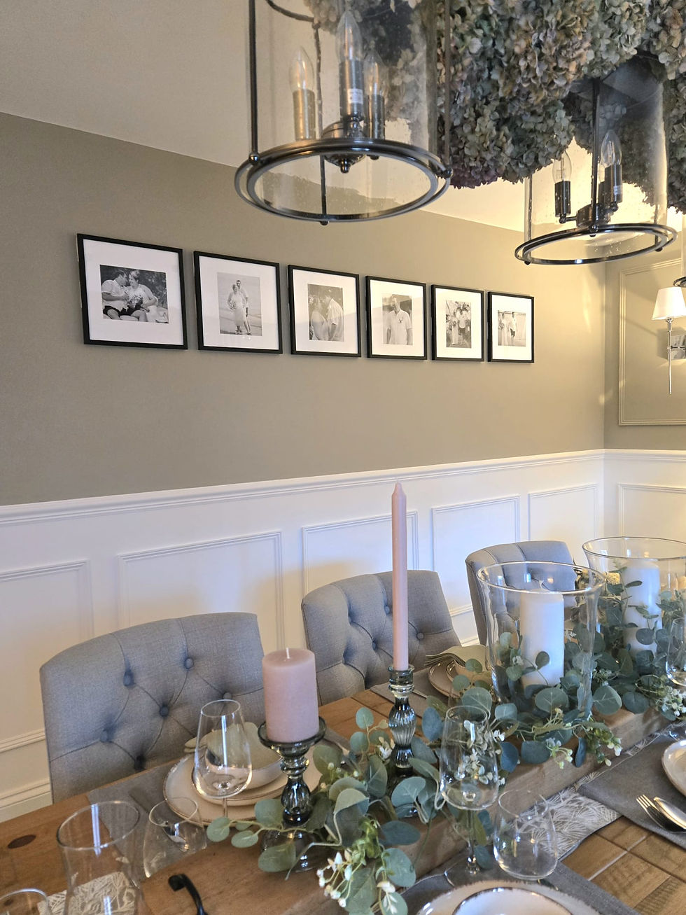
Unlike a normal white, Strong white has warmth and depth which makes it perfect for creating a traditional or modern décor. It adapts well to various lighting conditions and has a light grey undertone that offers a calm and inviting atmosphere. Again, like all Farrow & Ball colours it takes on various appearances depending on the room, what direction it faces and time of the day. In my dining room, which is easterly facing, it comes across as more creamy rather than a grey undertone as described ( see image 1). This colour almost contradicts itself, describing itself as a cool white with grey undertones when in actual fact it feels and looks warmer. I also used Strong White in our kitchen on every wall, which is a North and South facing room, so light is varied at all angles. The kitchen units are cashmere perimeter units which can have tendencies to throw out a pink tone, and carbon to the island, which is a pale black with hints of blue in certain lighting (see image 6). Strong white has a wonderful calming effect on the cashmere cabinets which neutralises the pink tones and highlights the grey tones more, whilst creating a powerful impact on the island by making it pop, drawing the eye and creating a stunning focal point. Strong White makes you question yourself, but stick with it. It's a useful, powerful colour with deceptive qualities.

Drop Cloth (no.283)
This colour is neither too yellow nor too grey. It reflects a mid grey beige which works perfectly in a modern or traditional setting. Its name is derived from decorators dust sheets and is great for a sophisticated relaxed look. It reacts well in most lighting conditions, but for me this colour really came to life of an evening when the lamps were on. It gives off a more muted, beautiful warm vibe, making those long dark nights feel so much more cosier. We had this paired with Farrow & Ball Green Smoke and the contrast of the two colours worked perfectly. It is such a versatile colour. Drop Cloth also sits well with Farrow & Ball Shaded White which is more classic & Shadow White which is a darker, moodier version of Drop Cloth. Together they create a stunning trio. This colour really is the gift that keeps on giving, especially if you are struggling to decide if you want a beige or a grey. It pulls colour schemes together and its gift to you is displaying both beige and grey qualities leaving you with no reason to choose when you can have both! (see image 7)


Comments